 Boats For Sale:


2009 CCF Special Edition 196 |
Post Reply 
|
Page <1 1415161718> |
| Author | |
TRBenj 
Grand Poobah 

Joined: June-29-2005 Location: NWCT Status: Offline Points: 21131 |
 Post Options Post Options
") Thanks(0) Thanks(0)
 Quote Reply Quote Reply
 Posted: July-24-2008 at 5:55pm Posted: July-24-2008 at 5:55pm |
I agree with the first point- Im not crazy about older boats with newer graphics and paint schemes. I think this is a little different though- this is a one-of boat that will both pay homage to the classic Correct Craft ski boat as well as showcase all of the 2009 appointments. If its subdued and classy, I think it will look great- and vinyl decals arent exactly permanant either if someone wants to make a change down the line. |
|
 |
|
|
quinner
Grand Poobah

Joined: October-12-2005 Location: Unknown Status: Offline Points: 5828 |
Post Options
Thanks(0)
Quote Reply
Posted: July-24-2008 at 5:48pm |
|
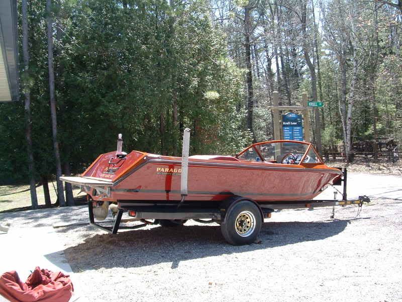
Keith,
For reference here are a couple pic's of the Paragon, as you can see the transom has "Paragon" and below that in block "Limited Edition", the "Glen Lake" we added, the sides had "Paragon" and in block "By Correct Craft". The Black stripe was factory painted. Going to be a very cool boat no matter what, looking forward to seeing the finished product. 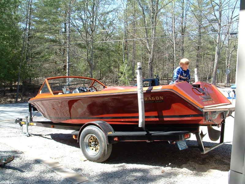
|
|
|
|
|
bkhallpass
Grand Poobah

Joined: March-29-2005 Location: United States Status: Offline Points: 4723 |
Post Options
Thanks(0)
Quote Reply
Posted: July-24-2008 at 5:48pm |
|
Not wild about blue lettering. Keep it white on the sides.
Whatever you do, the boat needs to flow. It can't be a hodge podge of different eras and ideas that don't work together. Keep it classy and timeless. BKH |
|
|
Livin' the Dream
|
|
|
|
|
M3Fan
Grand Poobah

Joined: October-22-2005 Location: United States Status: Offline Points: 3185 |
Post Options
Thanks(0)
Quote Reply
Posted: July-24-2008 at 4:35pm |
|
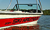
The more I think about it, the more it seems like mis-matched era graphics is not going to look right. It's going to look like when someone takes an older SN and puts new graphics on it- just out of place. I'm a huge fan of graphic eras on the CORRECT era boat. I think if any graphics should go on it, it should be the 2006-present standard Ski Nautique graphics, in white or straight black to pay homage to the 72 orange promo. That way the new owner doesn't get some sort of a frankenstein boat- they get a true 09 SN with some nice little touches.
|
|
|
2000 SN GT40 w/99 Graphics/Gel
2016 SN 200 OB 5.3L DI https://forum.fifteenoff.com |
|
|
|
|
75 Tique
Grand Poobah

Joined: August-12-2004 Location: Seven Lakes, NC Status: Offline Points: 6107 |
Post Options
Thanks(0)
Quote Reply
Posted: July-24-2008 at 4:28pm |
|
Well if we're voting on graphics, I think I go with the 76, color unimportant.
|
|
|
_____________
“So, how was your weekend?” “Well, let me see…sun burn, stiff neck, screwed up back, assorted aches and pains….yup, my weekend was great, thanks for asking.” |
|
|
|
|
RainDog
Platinum Member 

Joined: February-21-2007 Location: Mke/Grn Lake WI Status: Offline Points: 1387 |
Post Options
Thanks(0)
Quote Reply
Posted: July-24-2008 at 4:27pm |
Hmmm...I bet it would be no problem for Christine's! |
|
|
|
|
dmiracle
Senior Member 

Joined: July-22-2008 Location: Johns Creek, GA Status: Offline Points: 300 |
Post Options
Thanks(0)
Quote Reply
Posted: July-24-2008 at 4:25pm |
|
I love the graphics in the middle example above. Can you show that in blue and in white?
|
|
|
|
|
Keith
Admin Group
Owner / Operator of CorrectCraftFan.com Joined: October-20-2003 Location: Pepperell, MA Status: Offline Points: 1917 |
Post Options
Thanks(0)
Quote Reply
Posted: July-24-2008 at 4:12pm |
|
Beyond the CCF logo, a custom interior was not an option presented to me. The interior has already been ordered but I'm checking on what can still be changed. All Silver Cloud (i.e. off-white) may still be an option on the hatch covers. Continuing the stripe in the upholstery is probably not an option, but I will definitely see. We are restricted to the standard offerings for the most part. The rub rail, and custom graphics are not major production changes.
The reaction to the boat has been exactly what I was hoping for -- everyone seems very excited. Don't forget, the boat resumes production on Monday, July 28 and we'll then have daily photo updates of its progress! This particular boat will not have a tower so we don't need to discuss that any more. As Steve said, this boat is a Ski Nautique. -Keith |
|
|
|
|
JoeinNY
Grand Poobah

Joined: October-19-2005 Location: United States Status: Offline Points: 5695 |
Post Options
Thanks(0)
Quote Reply
Posted: July-24-2008 at 4:05pm |
|
I dont know on the full retro interior idea, it is a new boat with a new boat price and should feel like one, IMHO. There is definitely a need for a large Ski Nautique lettering on the side thats just how people are going to recognize how I, um mean the eventual owner, rolls.
|
|
|
|
|
RainDog
Platinum Member
Joined: February-21-2007 Location: Mke/Grn Lake WI Status: Offline Points: 1387 |
Post Options
Thanks(0)
Quote Reply
Posted: July-24-2008 at 3:52pm |
|
Wow, this is turning out to be one really sharp boat.
Good point about having lettering on a promo boat. I'd still prefer nekkid, but if not, the '76 graphics would look great in blue. My vote: - Blue Stripe - Blue Stripe through upholstery with swoosh delete - Possibly a blue stripe in upholstered side panels? - 60's metal or 70's plastic CC emblems - metal "Ski Nautique" emblem on dash - CCF.com logo on windshield and transom in blue - positively NO TOWER! This is a SKI Nautique. |
|
|
|
|
TRBenj
Grand Poobah
Joined: June-29-2005 Location: NWCT Status: Offline Points: 21131 |
Post Options
Thanks(0)
Quote Reply
Posted: July-24-2008 at 3:40pm |
|
Keith, congrats again for getting the boat built- its a testament to how great this site is! The opportunity for all of us to follow along as its being built will also be very cool to see.
I love the orange gel- very nice touch. I agree that there should be a large Ski Nautique logo on the side- it would look bare without it. A boot stripe would set off the all-orange scheme as well. Maybe Im alone on this one, but I dont care for the orange/blue combo on a boat- then again maybe its because Im not a Syracuse or Knicks fan.  I think another accent color like silver or gray or (preferably) black would look better- like the early 70's promo boats. I think another accent color like silver or gray or (preferably) black would look better- like the early 70's promo boats.
Not sure how difficult it would be, but a retro-ish interior would be cool as well. Instead of the usual swoosh pattern, a plain pattern with some pleats would look awesome. |
|
|
|
|
Keith
Admin Group
Owner / Operator of CorrectCraftFan.com Joined: October-20-2003 Location: Pepperell, MA Status: Offline Points: 1917 |
Post Options
Thanks(0)
Quote Reply
Posted: July-24-2008 at 3:23pm |
|
Agreed Joel. Here are some ideas (the side graphics could be any color):
Blank (cira 1972): 
1976 Graphics (which did also have the deck stripe): 
1986 Graphics: 
The gel has already been decided. The graphics are being applied at Adirondack Marine so we can decide that as a group. -Keith |
|
|
|
|
backfoot100
Platinum Member
Joined: January-03-2007 Location: United States Status: Offline Points: 1897 |
Post Options
Thanks(0)
Quote Reply
Posted: July-24-2008 at 3:20pm |
|
This is going to be way too cool of a boat. I like the racing stripe idea and continuing it into the upholstry. I also agree with Chris. The swope upholstry should be deleted if the stripe is put into it.
I agree with Kevin too. As much as I think it would look really cool without the side graphics, it's a Ski Nautique and it should be displayed proudly so that everyone knows exactly who made it. Please, please, please tell me this won't have a tower on it either!!!!! A modern day craft that is supposed to take on the aura of the classic boats before it cannot have a tower. It just ain't right. Just wish I had enough money to puck down on this thing because it would be an awesome boat to own. |
|
|
When people run down to the lake to see what's making that noise, you've succeeded.
Eddie |
|
|
|
|
M3Fan
Grand Poobah
Joined: October-22-2005 Location: United States Status: Offline Points: 3185 |
Post Options
Thanks(0)
Quote Reply
Posted: July-24-2008 at 3:14pm |
|
I think the key is going to be to get some mock-ups in place and then vote on them.
|
|
|
2000 SN GT40 w/99 Graphics/Gel
2016 SN 200 OB 5.3L DI https://forum.fifteenoff.com |
|
|
|
|
Riley
Grand Poobah
Joined: January-19-2004 Location: Portland, ME Status: Offline Points: 7952 |
Post Options
Thanks(0)
Quote Reply
Posted: July-24-2008 at 3:12pm |
If Reid needs to raise some money by selling his beloved Classic, I'd like to be first in line for that one. |
|
|
|
|
dmiracle
Senior Member
Joined: July-22-2008 Location: Johns Creek, GA Status: Offline Points: 300 |
Post Options
Thanks(0)
Quote Reply
Posted: July-24-2008 at 1:56pm |
|
Keith,
I'm recently registered but a longtime lurker here. First, congratulations on the custom Nautique. Like others here, I agree that all your hard work regarding this valuable site should be rewarded by CC. The boat looks phenomenal. Colors are wayback cool and the racing stripe is awesome. I wanted to weigh in on the side graphics. For me, one of the most legendary attributes of a Nautique is the lettering down the side. It makes a bold, proud statement. While I'm typically a very "no bling" kind of guy, I think this attribute is key to giving the boat the appropriate identity it deserves. Suggestion - Why not pick a particular year that included the racing stripe as part of the styling and "re-create" the graphics of that year? Regardless of the direction you go here, this is a great idea and you deserve the boat for yourself. Nicely done! |
|
|
|
|
Hollywood
Moderator Group

Joined: February-04-2004 Location: Twin Lakes, WI Status: Offline Points: 13512 |
Post Options
Thanks(0)
Quote Reply
Posted: July-24-2008 at 1:26pm |
I also believe this is very important. Too many times you see some "special edition" that is so over jazzed it's comical. "Ski Nautique" needs to be there, the styling is already based off CCFan. |
|
|
|
|
Keith
Admin Group
Owner / Operator of CorrectCraftFan.com Joined: October-20-2003 Location: Pepperell, MA Status: Offline Points: 1917 |
Post Options
Thanks(0)
Quote Reply
Posted: July-24-2008 at 12:59pm |
|
I too really like the deck 'racing stripe' and agree it would look great going down the back of the driver's seat, across the hatch cover, and perhaps down the transom.
I'll put a call into Correct Craft today and see what our options are at this point. Keep the feedback coming! Thanks, Keith |
|
|
|
|
81nautique
Grand Poobah

Joined: September-03-2005 Location: Big Rock, Il Status: Offline Points: 5772 |
Post Options
Thanks(0)
Quote Reply
Posted: July-24-2008 at 12:53pm |
Joel, Do you need another "Old School" fix?  . You know it's there for you anytime you need to work that out of your system. . You know it's there for you anytime you need to work that out of your system.
|
|
|
You can’t change the wind but you can adjust your sails
|
|
|
|
|
79nautique
Grand Poobah

Joined: January-27-2004 Location: United States Status: Offline Points: 7872 |
Post Options
Thanks(0)
Quote Reply
Posted: July-24-2008 at 12:24pm |
that sounds cool but maybe also continue on the pads of the storage lockers, but in solid white, enstead of the factory designed swope, as to look like a continous stripe the length of the boat. |
|
|
|
|
LGKen82
Newbie 

Joined: July-23-2008 Location: Lake George Status: Offline Points: 35 |
Post Options
Thanks(0)
Quote Reply
Posted: July-24-2008 at 12:10pm |
|
Keith,
What do you think about putting the blue strips down the seat back and base of the back seat? |
|
|
|
|
Kristof
Grand Poobah
Joined: October-08-2007 Location: Bree, Belgium Status: Offline Points: 3391 |
Post Options
Thanks(0)
Quote Reply
Posted: July-24-2008 at 11:24am |
79, that's a great idea! |
|
|
- Gun control means: using BOTH hands!
- Money doesn't make one happy, but when it rains cats and dogs, it's still better to cry in a Porsche than on a bicycle... |
|
|
|
|
M3Fan
Grand Poobah
Joined: October-22-2005 Location: United States Status: Offline Points: 3185 |
Post Options
Thanks(0)
Quote Reply
Posted: July-24-2008 at 11:11am |
|
If any side graphics were to go on there, I think the 80-81 graphics in blue would look amazing, and would look modern enough to match the boat nicely. I still vote for the plain sides though.
|
|
|
2000 SN GT40 w/99 Graphics/Gel
2016 SN 200 OB 5.3L DI https://forum.fifteenoff.com |
|
|
|
|
79nautique
Grand Poobah
Joined: January-27-2004 Location: United States Status: Offline Points: 7872 |
Post Options
Thanks(0)
Quote Reply
Posted: July-24-2008 at 10:55am |
|
OUTSTANDING EXCELLENT COLOR CHOICE.
the blue stripe is a nice touch, graphics on the sides would be cool enstead of the smaller CCF logo towards the rear, but like the 70's graphics using the CCF logo with a modified swope of the underscoring F in fan so that it flattens out after the rr in correct and continues forward to a point like the 70's style was like. transom graphics Correct Craft Fan Limited Edition  
|
|
|
|
|
lewy2001
Grand Poobah

Joined: March-19-2008 Location: NSW Australia Status: Offline Points: 2234 |
Post Options
Thanks(0)
Quote Reply
Posted: July-24-2008 at 10:34am |
|
I think the side graphics off the 78 Ski Nautique would suit the single coloured hull the best.
It looks a little to plain without decals. Also as a promo boat the marketing of the brand will be important. It would be nice though with more of a retro look to suit this awesome web site. Congrats Keith on the website and the relationship your are developing with CC. I dont know what I did with my leisure time before finding this site. It's addictive I check my email first thing in the morning then have a quick browse thru CCFan before hitting the grindstone. |
|
|
If you're going through hell, keep going
89 Ski <a href="http://www.correctcraftfan.com/diaries/details.asp?ID=5685" ta |
|
|
|
|
BuffaloBFN
Grand Poobah

Joined: June-24-2007 Location: Gainesville,GA Status: Offline Points: 6094 |
Post Options
Thanks(0)
Quote Reply
Posted: July-24-2008 at 10:22am |
|
Congats Keith...very cool boat! I think it speaks volumes that you guys have accomplished this without the factory doing it all.

I also like the blue accent all the way through...nice touch. |
|
|
|
|
Kristof
Grand Poobah
Joined: October-08-2007 Location: Bree, Belgium Status: Offline Points: 3391 |
Post Options
Thanks(0)
Quote Reply
Posted: July-24-2008 at 7:14am |
|
Darn... once again, I didn't get the right numbers on the lottery...

|
|
|
- Gun control means: using BOTH hands!
- Money doesn't make one happy, but when it rains cats and dogs, it's still better to cry in a Porsche than on a bicycle... |
|
|
|
|
Kristof
Grand Poobah
Joined: October-08-2007 Location: Bree, Belgium Status: Offline Points: 3391 |
Post Options
Thanks(0)
Quote Reply
Posted: July-24-2008 at 7:11am |
Absolutely! I would definitely go for the blue stripe, no decals on the side, and "Correct Craft - Competition Tow Boat" (in the same blue and font as "CCFan") decals on the transom... |
|
|
- Gun control means: using BOTH hands!
- Money doesn't make one happy, but when it rains cats and dogs, it's still better to cry in a Porsche than on a bicycle... |
|
|
|
|
Nautique2001
Grand Poobah

Joined: June-14-2004 Location: Massachusetts Status: Offline Points: 2832 |
Post Options
Thanks(0)
Quote Reply
Posted: July-23-2008 at 11:47pm |
|
Wow, I'm playing catch-up with this outstanding thread. Congratulations on bringing CCF.com and all of us to the next level, Keith. We're definitely on the Correct Craft Inc. radar thanks to you.
I didn't know how the orange would look, but I love the shade as shown in the production photos. That boat will have plenty of get-up-and-go!!! I was disappointed to see the Python engine go, but this makes up for it. I hope the graphics have an old school look. I want to see this boat have it's own Correct Craft brochure! Ken |
|
|
|
|
LGKen82
Newbie
Joined: July-23-2008 Location: Lake George Status: Offline Points: 35 |
Post Options
Thanks(0)
Quote Reply
Posted: July-23-2008 at 11:02pm |
|
Thanks Alan,
It's a pleasure and an honor to be part of it. It was great seeing you Phil in LG and glad you had a good time, I have a call into a friend who has a helicopter and I'm going to see what he can do. I'll keep you posted |
|
|
|
|
Post Reply
|
Page <1 1415161718> |
 Tweet
Tweet
|
| Forum Jump | Forum Permissions You cannot post new topics in this forum You cannot reply to topics in this forum You cannot delete your posts in this forum You cannot edit your posts in this forum You cannot create polls in this forum You cannot vote in polls in this forum |


 Topic Options
 M3Fan wrote: